Rebranding Irista
In this project we reset the visual identity of Canon’s digital services, and delivered a design system and supporting Sketch Libraries to ensure fast delivery and coherence across products.
The Canon Digital Services Design Team are responsible for a suite of digital products. Each of these products had been commissioned as stand-alone initiatives and developed in isolation. In most cases, they had been brought in-house, following initial development by externalby agencies. The result was ad hoc brand implementation and products lacking a coherent identity. Irista, in particular, had never been strongly connected to Canon from a brand perspective, despite its position at the centre of the Canon ecosystem.
We needed to articulate Irista clearly as a Canon product, at the same time defining a robust and contemporary set of visual identity guidelines. The guidelines would supersede various existing documents related to print and marketing, and would address the context of app and service design specifically.
Key Issues:
- Customer experience impacted by inconsistent brand expression and design patterns across products
- Canon brand not sufficiently leveraged in Irista
- Inefficiencies resulting from need to support multiple design systems
Approach:
- Create a design system, founded on a set of key principles and the concept of a product ecosystem
- Leverage platform guidelines and UI patterns
- Create shared accessible documentation
- Build a set of Sketch Libraries to supportdesignconsistencyand speed delivery in an agile environment.
Principles
The guidelines are built around four Key Principles:
Enhance the user experience – When experience and usability is good it always benefits the brand. The guidelines should not conflict with accessibility concerns or user-centred design best practice.
Promote good design – Help designers establish design consistency across the ecosystem. Don’t legislate against designers making informed design decisions.
Respect the core experience principles of the platform on which the service is built – The visual identity architecture should be interpolated in a manner consistent with the interface guidelines of the platform
Embrace change – Platforms and devices are constantly evolving. We need a living document that can continuously improve, adapt to changing circumstances, and remain true to its core identify.
Logo
The first step was to reconnect Irista with Canon by updating the logo, positioning it as one of a number of services within the Canon ecosystem.
Colour
We also needed to re-evaluate our colour palette as Irista’s legacy palette is not based on Canon brand colours.
Canon’s primary brand colour is a distinctive, dark red tone known as Canon Red. Red is used in combination with black and white to form the primary palette. In the new system, we reserve Canon Red for the Canon logo, and for when a dark tone of red is needed, and have introduced a lighter and more vibrant red, better suited for use on screens.
 Primary brand palette
The new ‘Screen Red’ also corrected an existing accessibility issue relating to colour contrast.
 Colours tested using the WCAG 2.0 guidelines for contrast accessibility
Background Colours Designed for Photographers
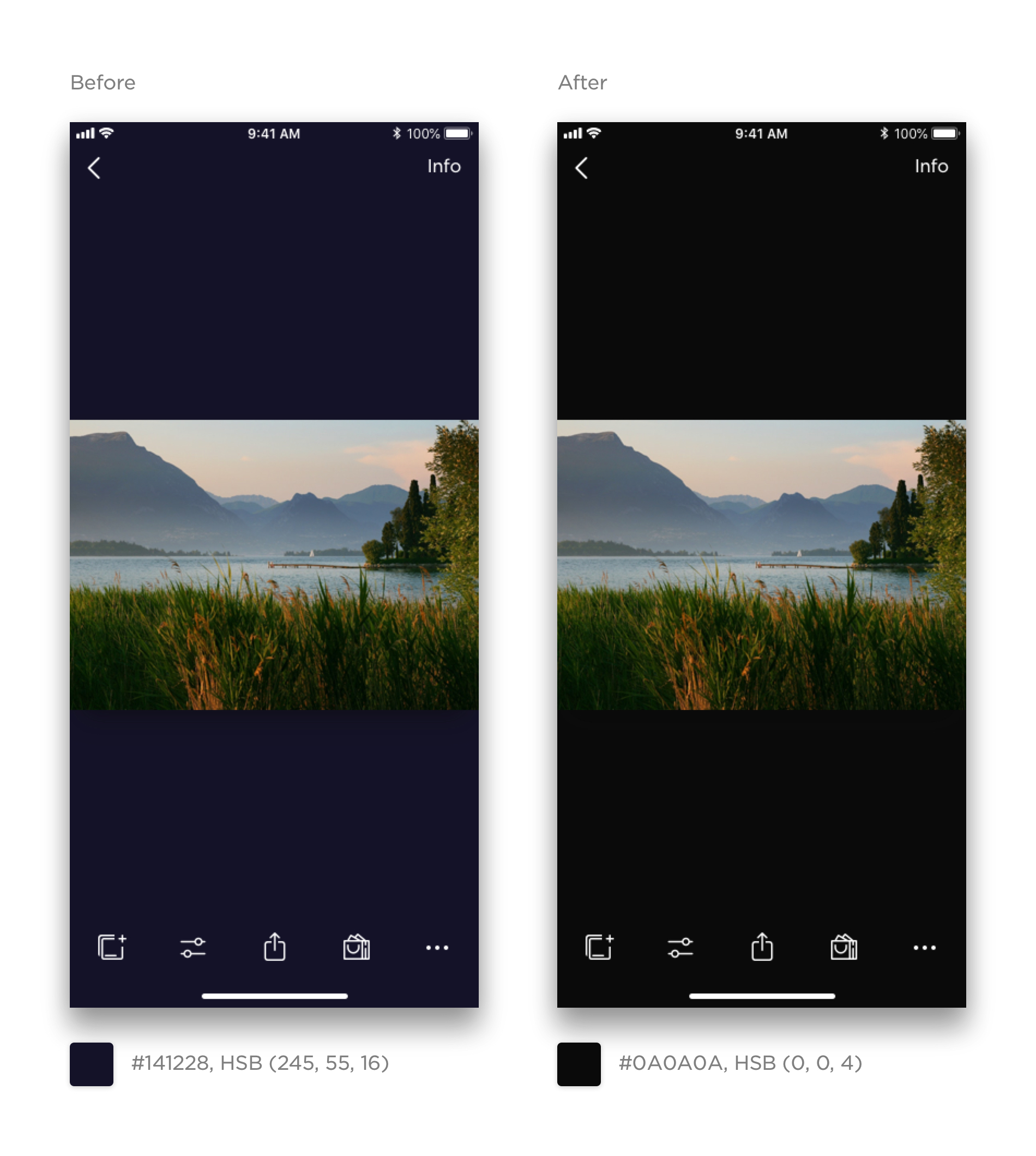
Naturally, photographers want to see their creations set against a neutral background. Irista’s blacks and greys had a noticeable blue hue, and users had complained about this via customer support channels.
 Placing photography on a neutral background to avoid colour interference
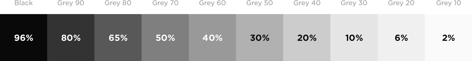
The new grey scale consists of pure greys with zero hue and saturation levels. There are ten levels in total (introducing two additional tones), each equivalent an opacity level of pure black.
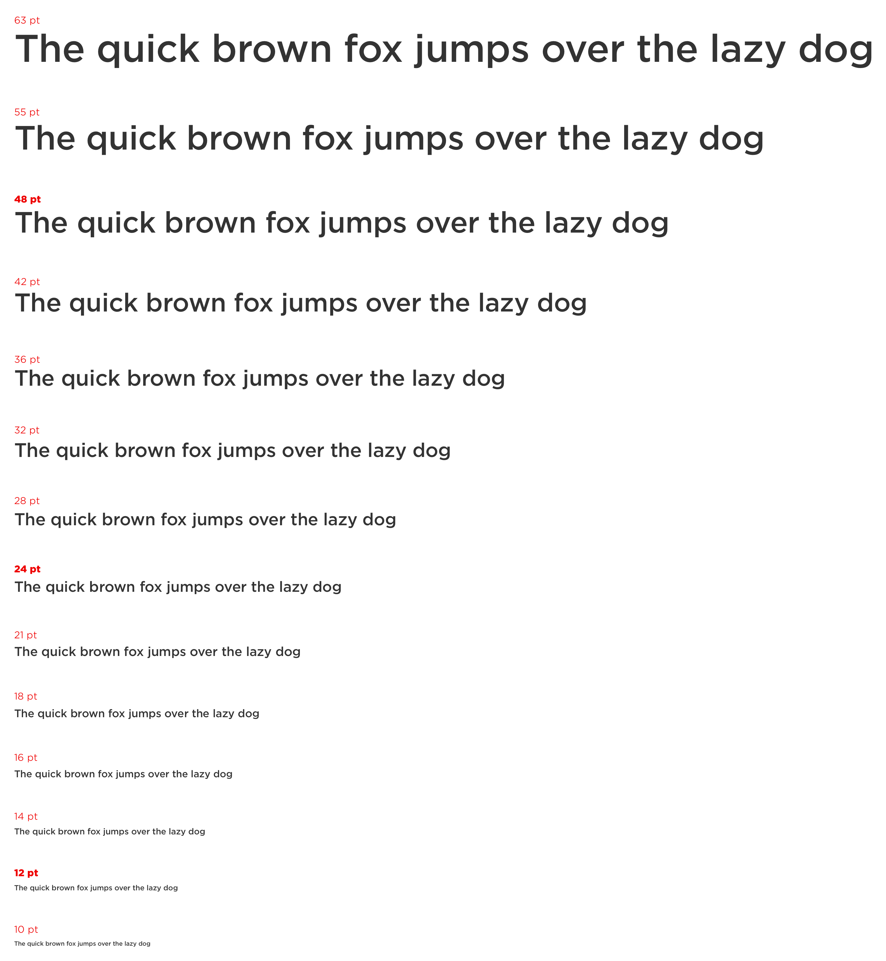
Typography
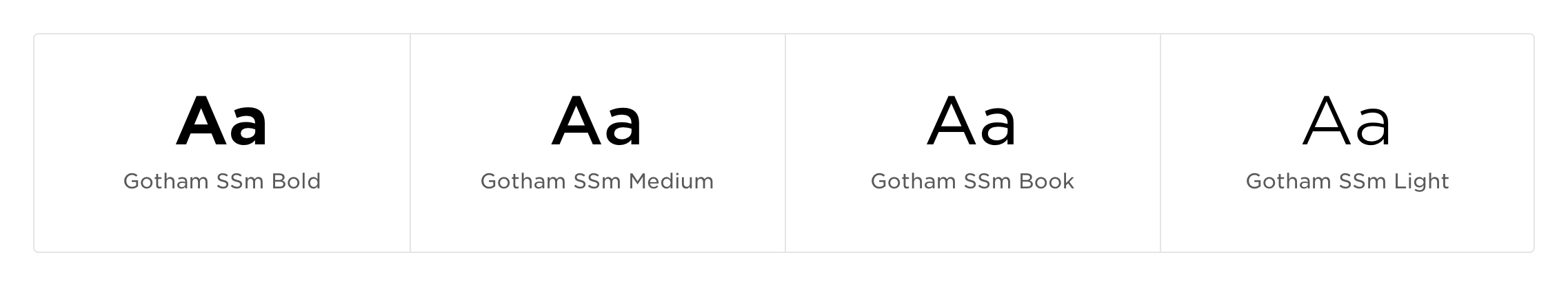
All platforms – Web, iOS and Android – use the same font and type system.
Type is used at fixed sizes according to a typographic scale so that type feels balanced and harmonious. The system is based on a pentatonic musical scale (where the font size doubles every five intervals) and closely matches the classical typographic scale.
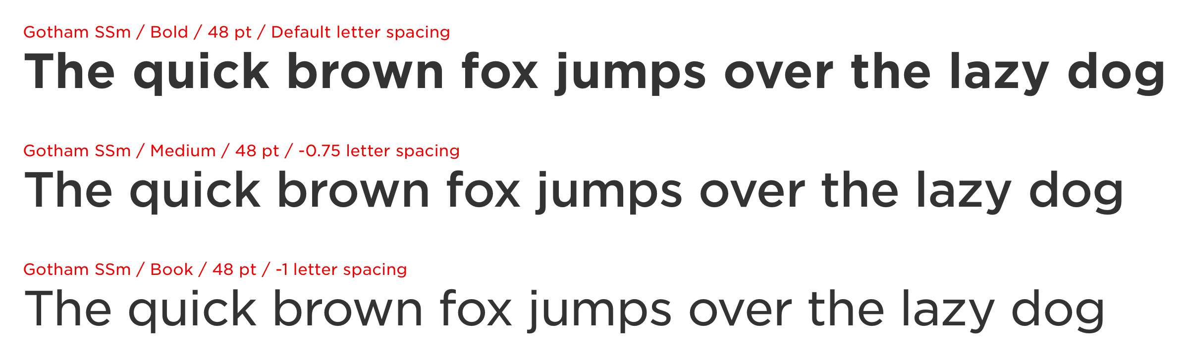
Gotham is a naturally loose-spaced typeface. We have adjusted its default letter spacing to improve readability according to font weight and use case. Titles which typically feature larger type benefit from tighter letter spacing. Body copy, which typically features smaller type, requires looser spacing as more space between letters increases the contrast between each letter shape.
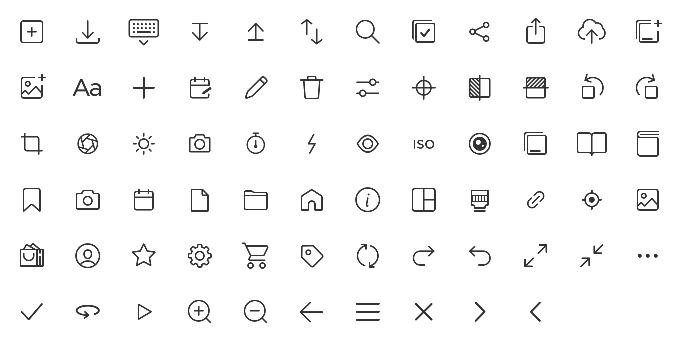
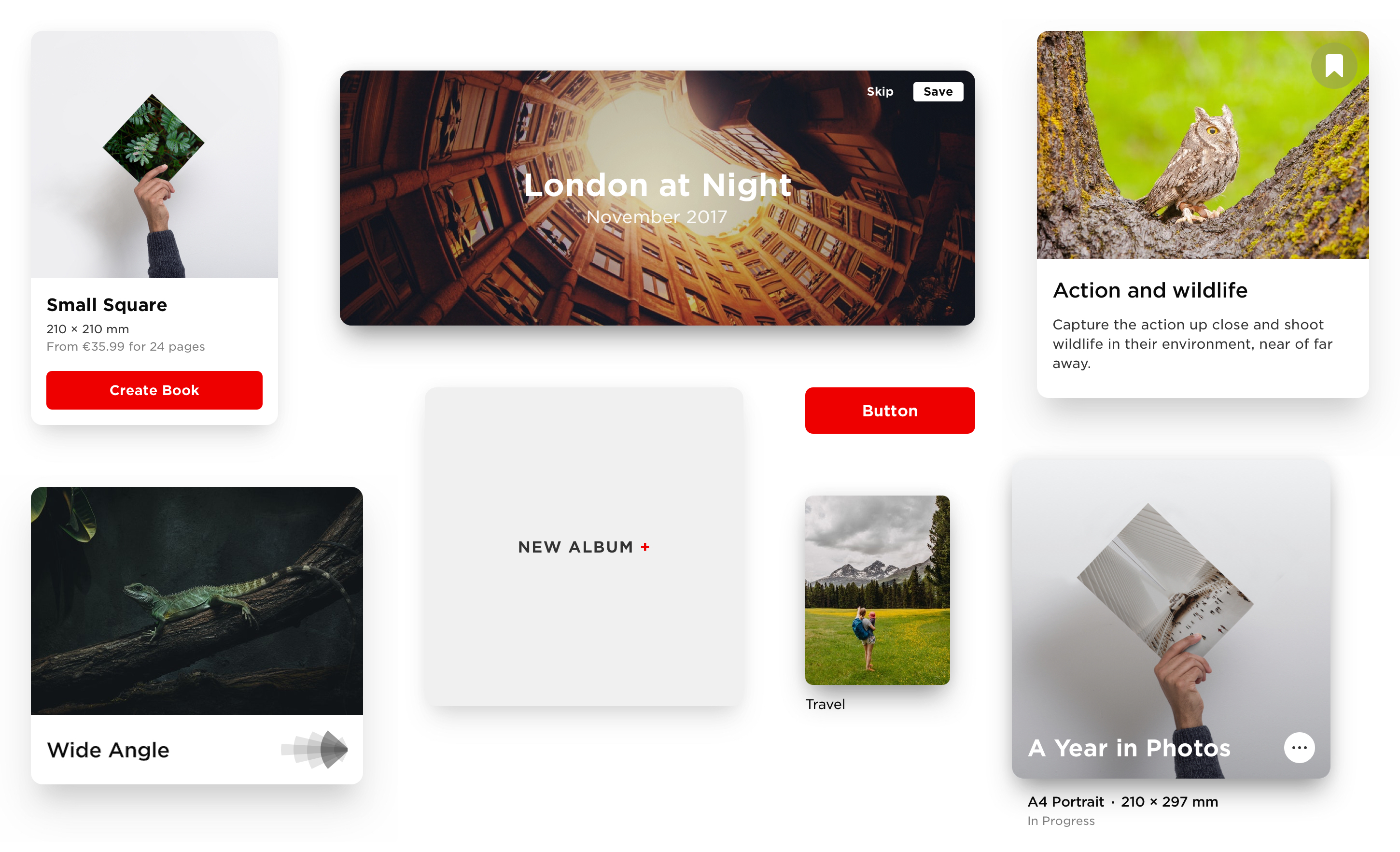
Iconography
On web and iOS we use a bespoke icon set. Icons are formed from simple outlined shapes, characterised by soft corners, medium stroke weight and rounded ends.
It was important to define grid and keyline metics to ensure icons were visually consistent across the set.
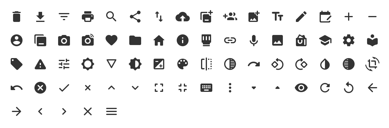
Icons are used at smaller sizes on Android making filled icons more appropriate. We use icons based on the Material Design ‘Rounded Theme’ as their soft edges correspond well with the icons used on other platforms.
Element Styling
The lines and shapes from which icons buttons and other user interface elements are formed all have rounded corners. Corner radii scale in increments, according to the size of the element. This ensures that screen elements are visually consistent and sit together as a family.
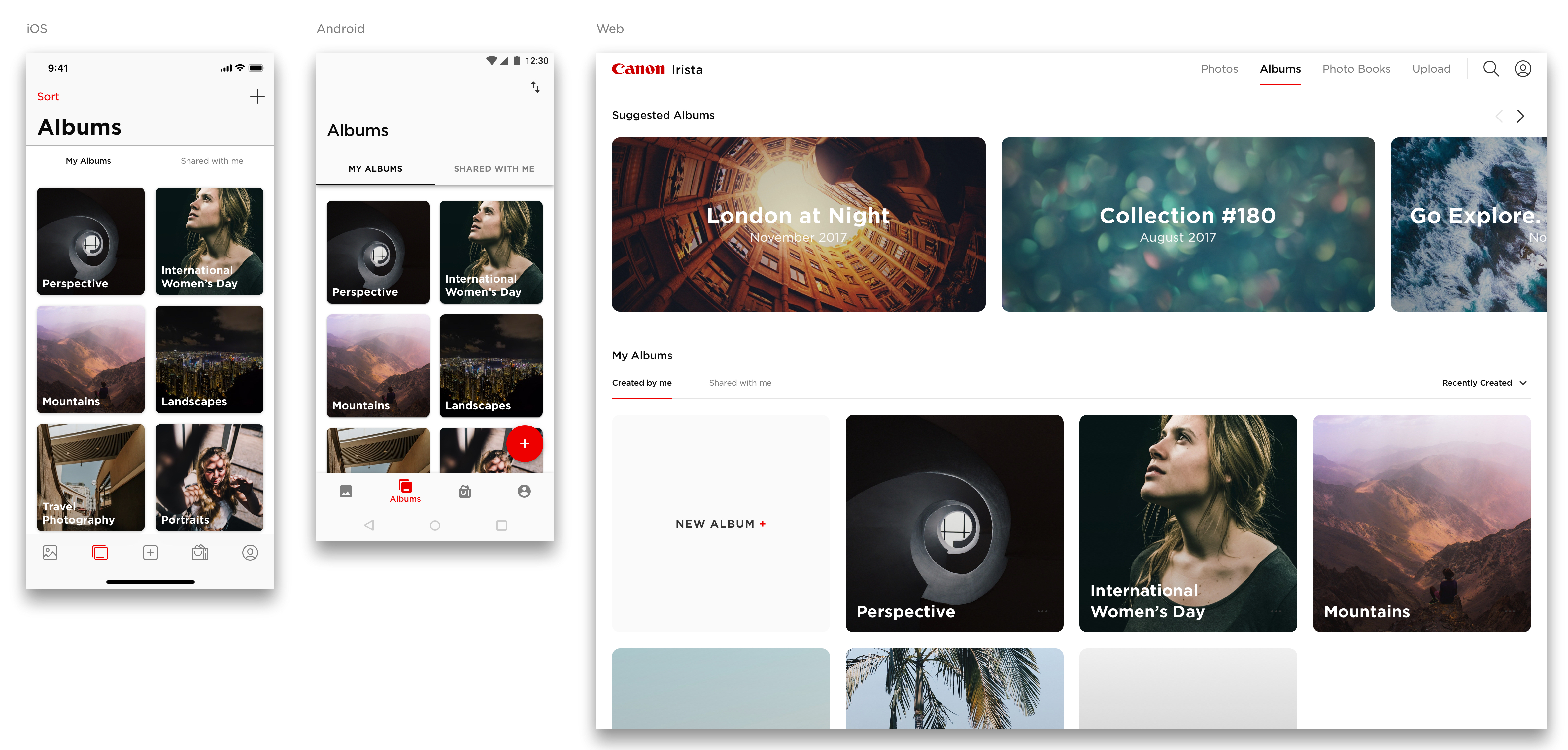
Maintaining a Coherent Visual Identity Across Platforms
Our decision to respect platform experience principles and use platform native UI patterns helps usability but is a challenge when it comes to implementing a consistent visual identity across platforms. Traditionally, Material Design guidelines have been particularly prescriptive. But Google have recently introduced Material Theming and this created an opportunity for improving brand coherence.
All platforms have identical typography and button styles, and use rounded corners consistent. We introduced bottom navigation on Android and app bars with large titles on both iOS and Android.
Sketch Libraries
A lot of effort went into building component libraries in Sketch. This helps to keep existing designs in sync as the design system evolves, and means that the design system can be implemented in any new design work quickly and easily.
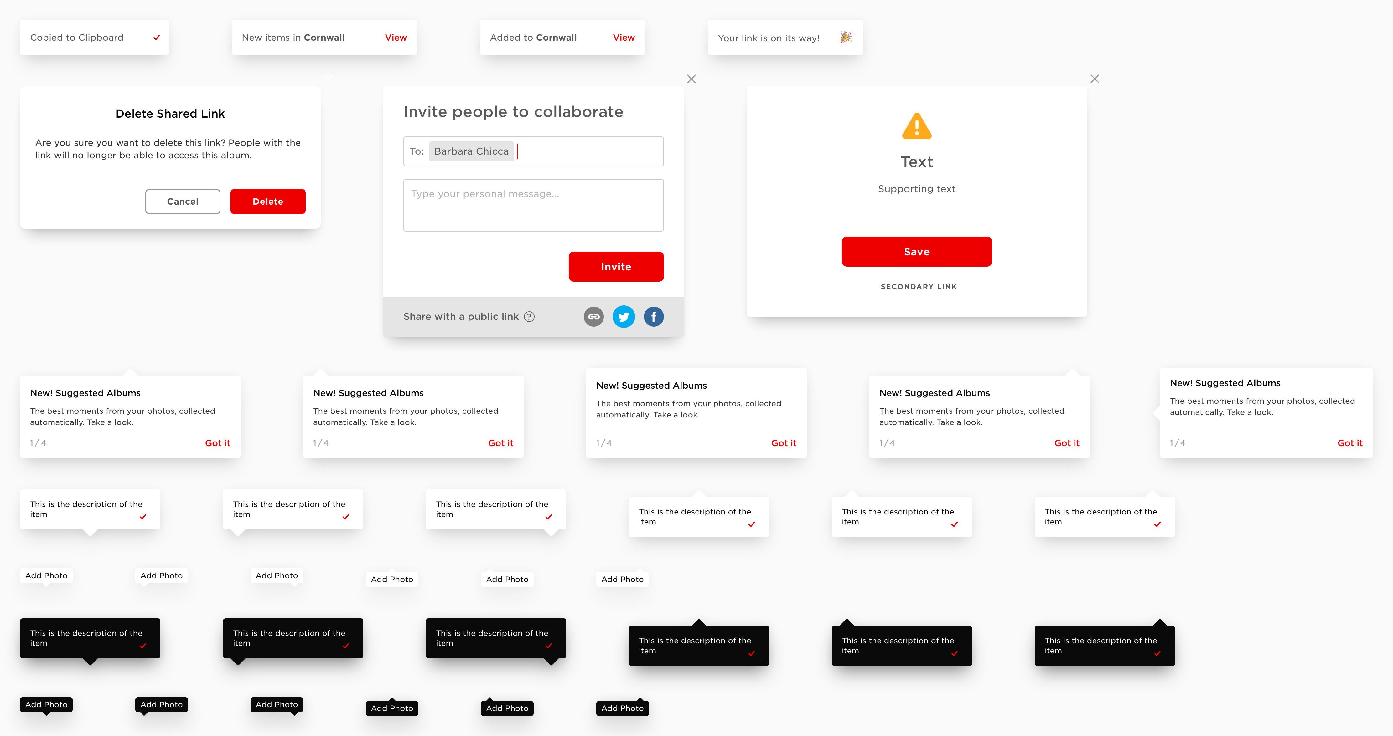
‘Pop-ups and Tooltips’ – Sketch Library Symbols
Documentation
It’s really important that the design system is properly documented and shared across the team and with stakeholders. We use Dropbox Paper to document and define the system, making it easy to update, share and gather feedback and comments. The guidelines are also published as a PDF, at intervals, for distribution to external stakeholders.
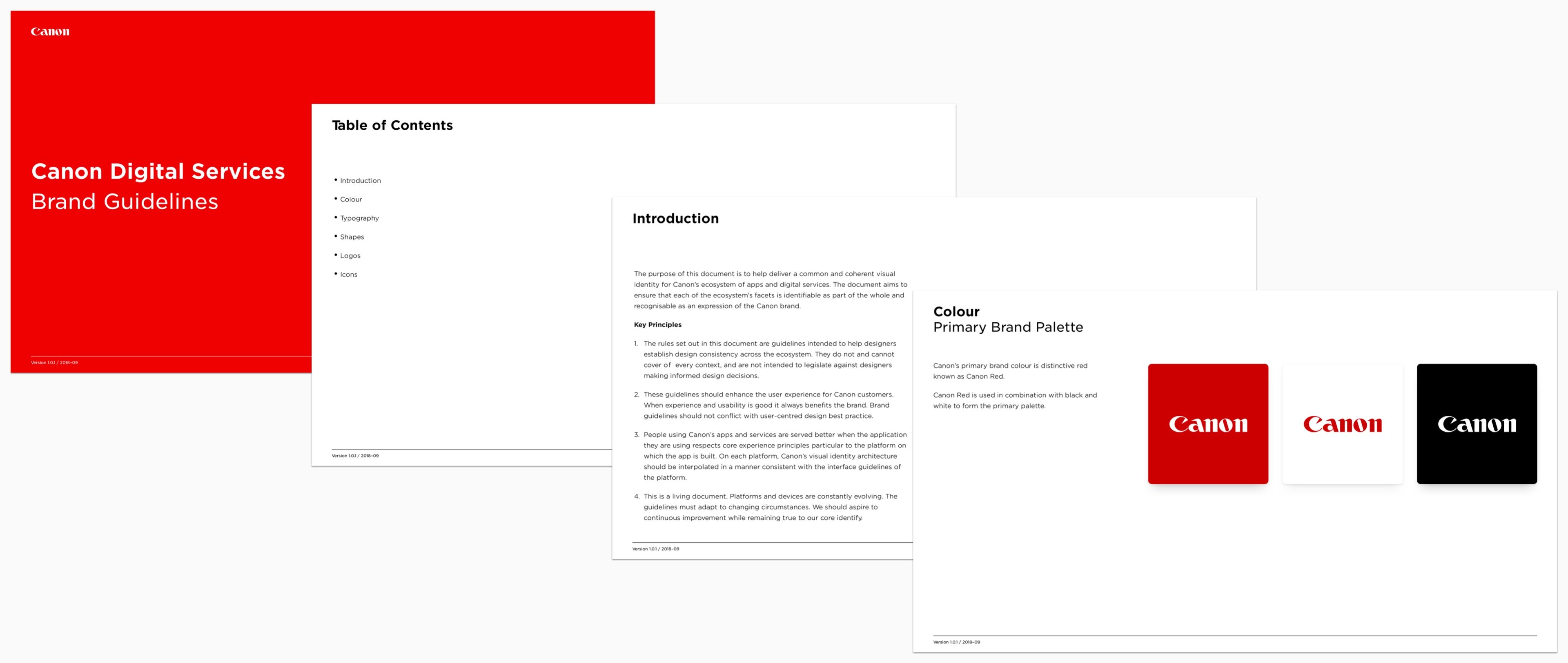 Brand Guidelines Documentation – Canon Digital Services