Improving the Product
The following is a summary of small but important changes made to improve information architecture, visual design & usability across the platform.
Browsing
The Photos screen displays your entire image collection in a time-ordered grid. We noticed two fundamental issues with the existing design:
Aspect ratio:
Square thumbnails don’t work for photographers.
"I often take both landscape and portrait shots of the same scene… When you look at your photos on Irista you can’t tell which is which."
Image Size:
The existing design uses a responsive grid and very large images. Only a few images can be viewed at a time, even on the largest monitors. This isn’t optimal for browsing your collection.
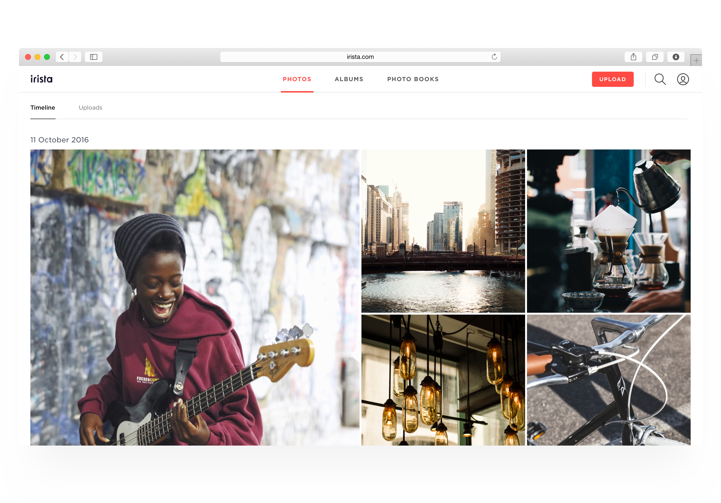
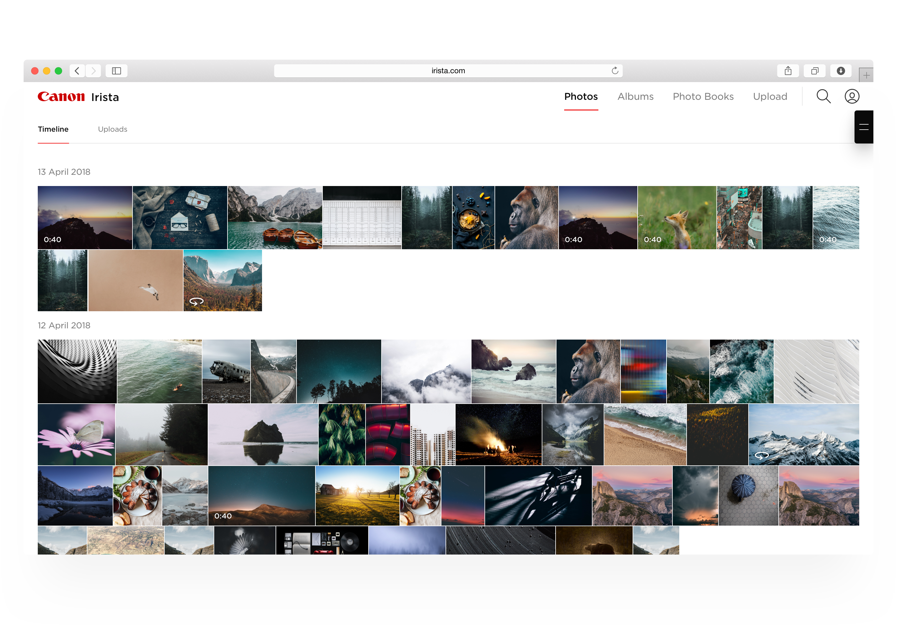
The new design uses fixed height images rather than ones that scale in proportion to the screen so larger screens fit more, not bigger, photos. And we have radically reduced the size of thumbnails.
We tested a range of different sizes, finding a sweet-spot with the height set close to 100px. At this scale, people still found it easy to scan and pick out images, and they were able to browse and locate photos much more efficiently.
 Image thumbnails for different media types
Selecting Images
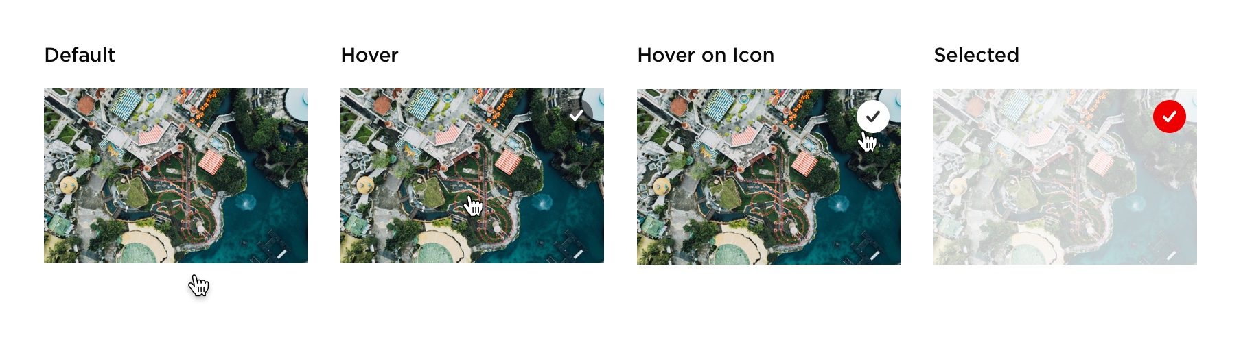
Previously, selected photos were differentiated only by the red checkmark in the corner and a thin grey border. We removed the border and reduce the opacity of the selected photo to 25%. The effect is to de-emphasise photos you have already selected making it easier to scan and select from those that remain.
 Improved interaction behaviour and component states
Improvements have also been made to the group selection control. “Select” on the header of each date section on hover so that users can easily select large groups of images taken on a particular date.
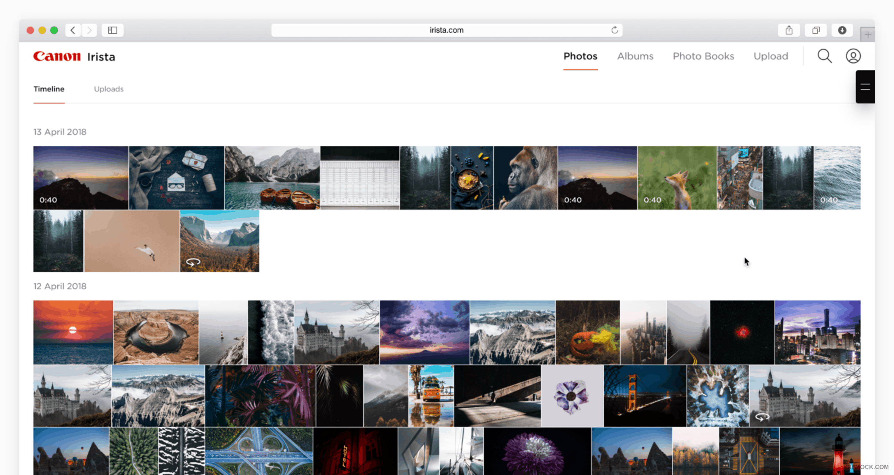
Visual Clarity
Switching menu items to lowercase and removing unnecessary lines has improved the clarity and appearance the top navigation.
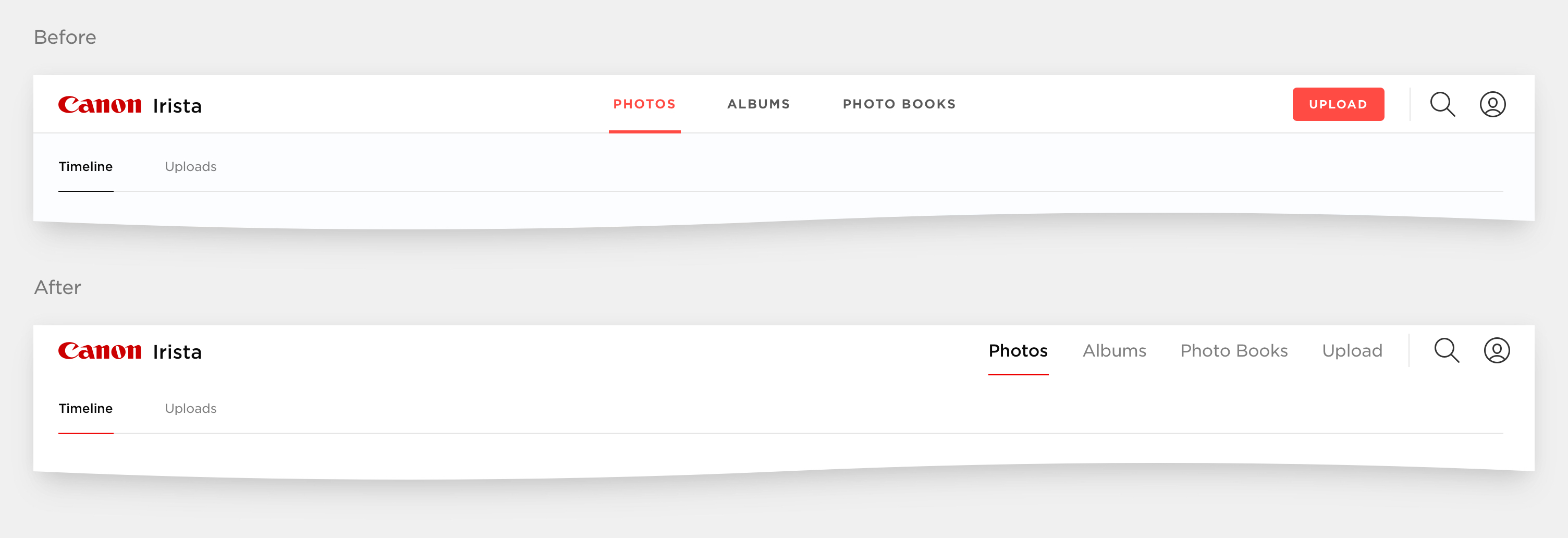 Cleaner top navigation
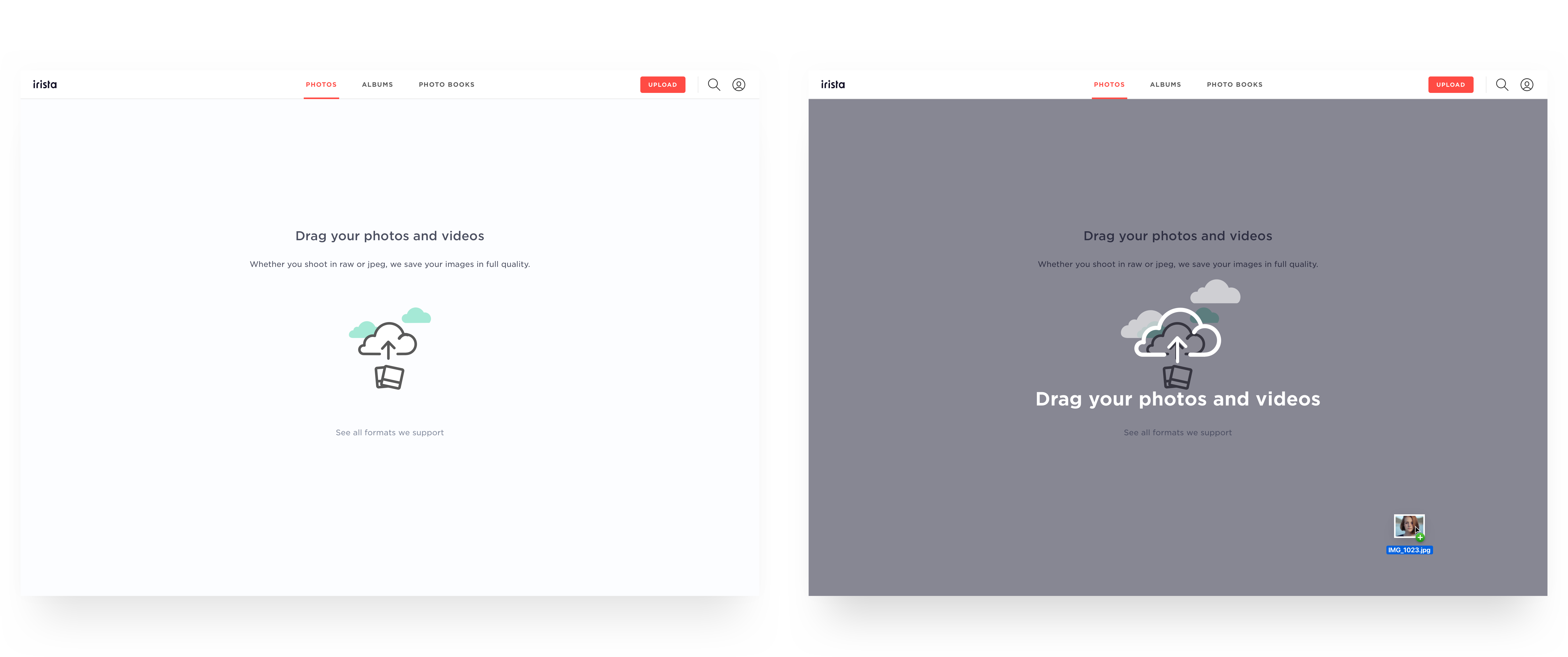
The call to action to new users to start by uploading images has been made clearer and more impactful. The new illustration for this empty state helps users discover how. Access to parts of the site that can’t be used until images have been uploaded has been disabled.

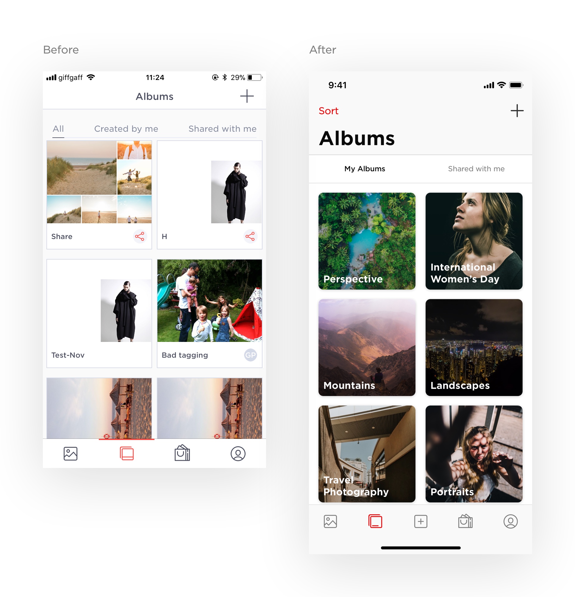
Album identity has been strengthened through the introduction of bigger, bolder album titles, placed over the cover photo rather than in a label underneath. The aspect ratio and layout of the cards was rationalised, and we introduced larger radius corners to give a more modern and friendly feeling, and to better differentiate from the hard edges used for individual images.

iOS
The iOS app has benefited from a range of information architecture, interaction design and styling improvements.
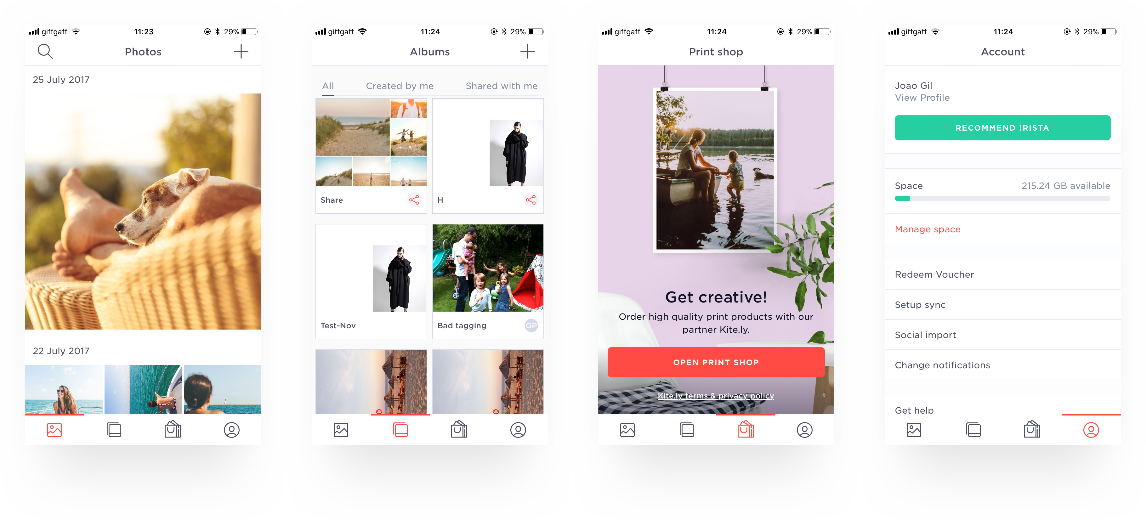
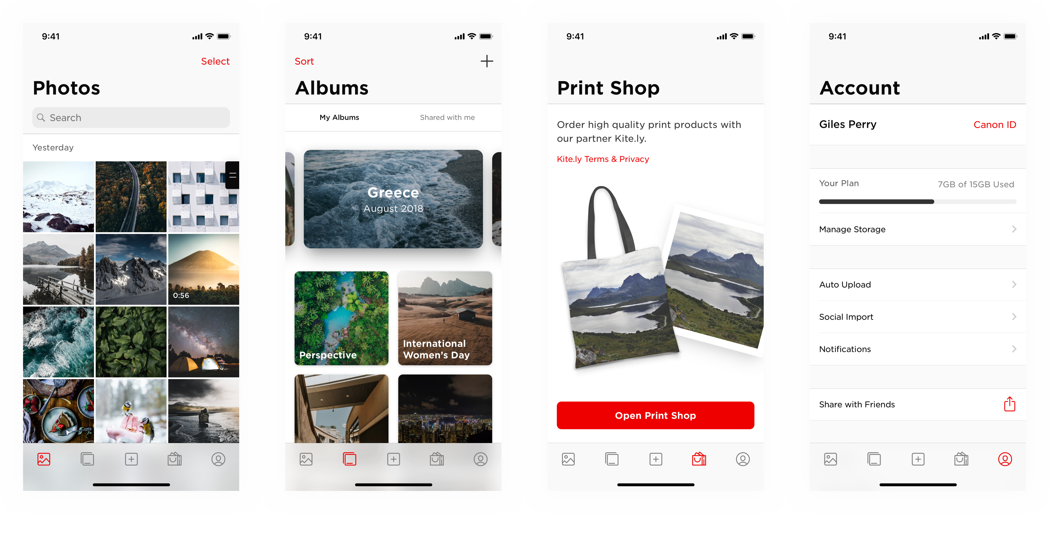
When icons are too generic it can be hard to know what a button does, particularly if the same icon has a different meaning depending on the context. This was addressed by creating unique icons for each action and making greater use of text buttons in navigation bars.
 One icon, many meanings – the issue of generic iconography in the previous design.
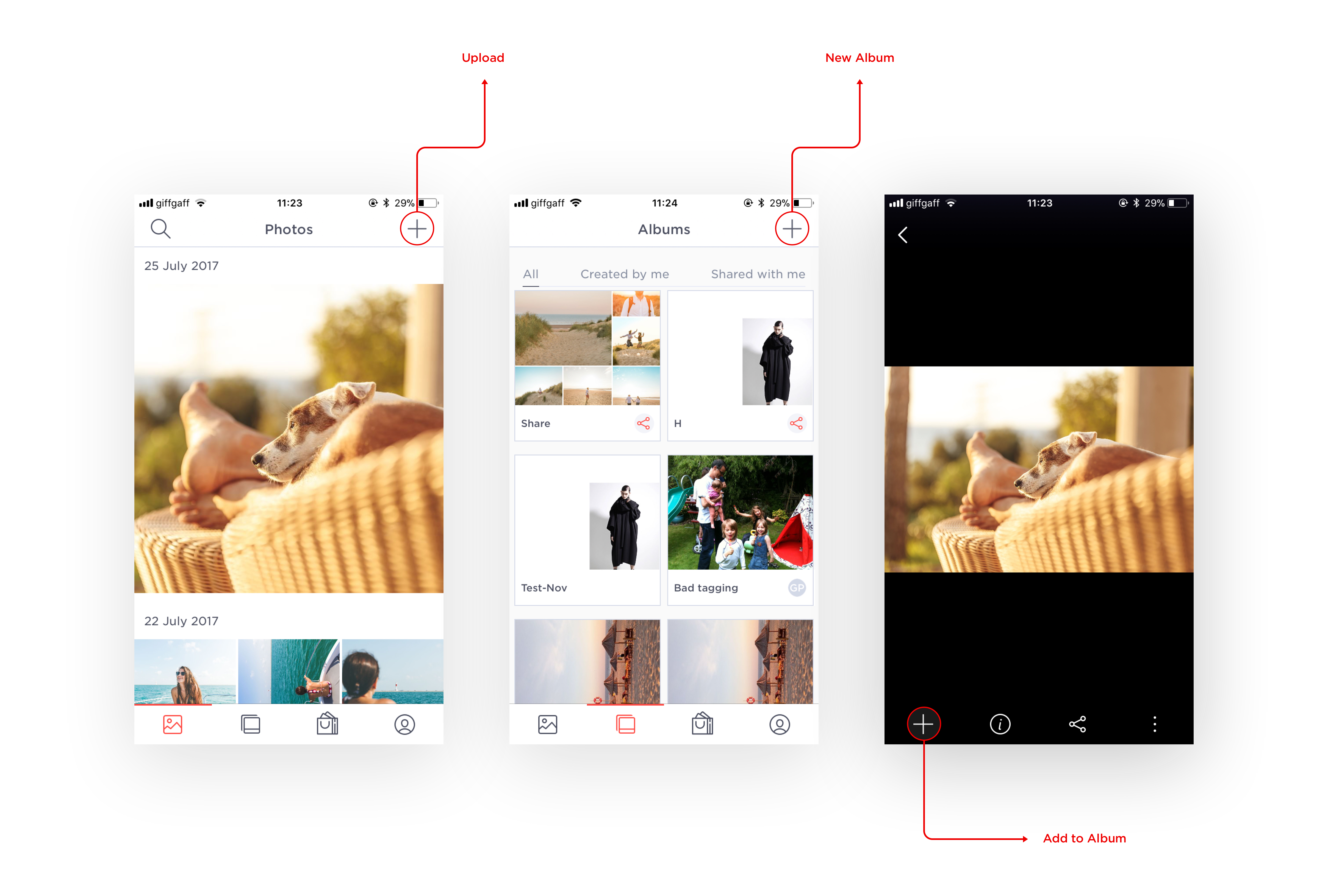
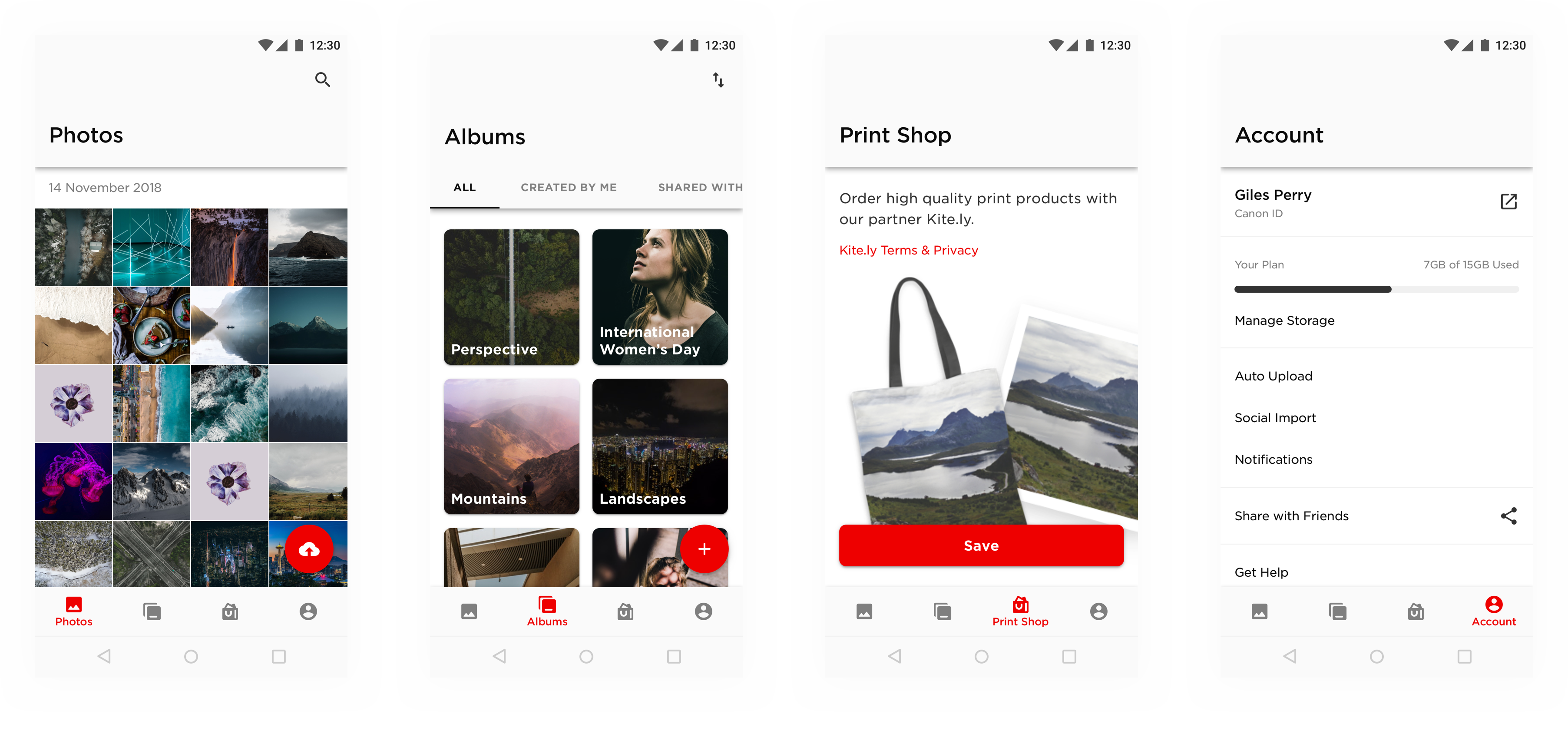
Upload was given more prominence by moving it from the navigation bar on the Photos screen into the tab bar. It was important that a function so central to the platform was accessible from anywhere in the app. We also saw that users were often unable to discover the Press and Hold interaction for selecting images. A button to enter “Selection” mode was added top right, in the space freed up by moving Upload.
Irista’s powerful computer vision based search feature is particularly relevant on mobile where limited screen real estate makes browsing to find images less efficient. More affordance was given to this feature by adding a collapsible search bar at the top of the Photos screen.
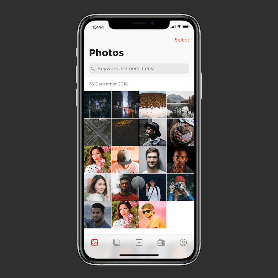
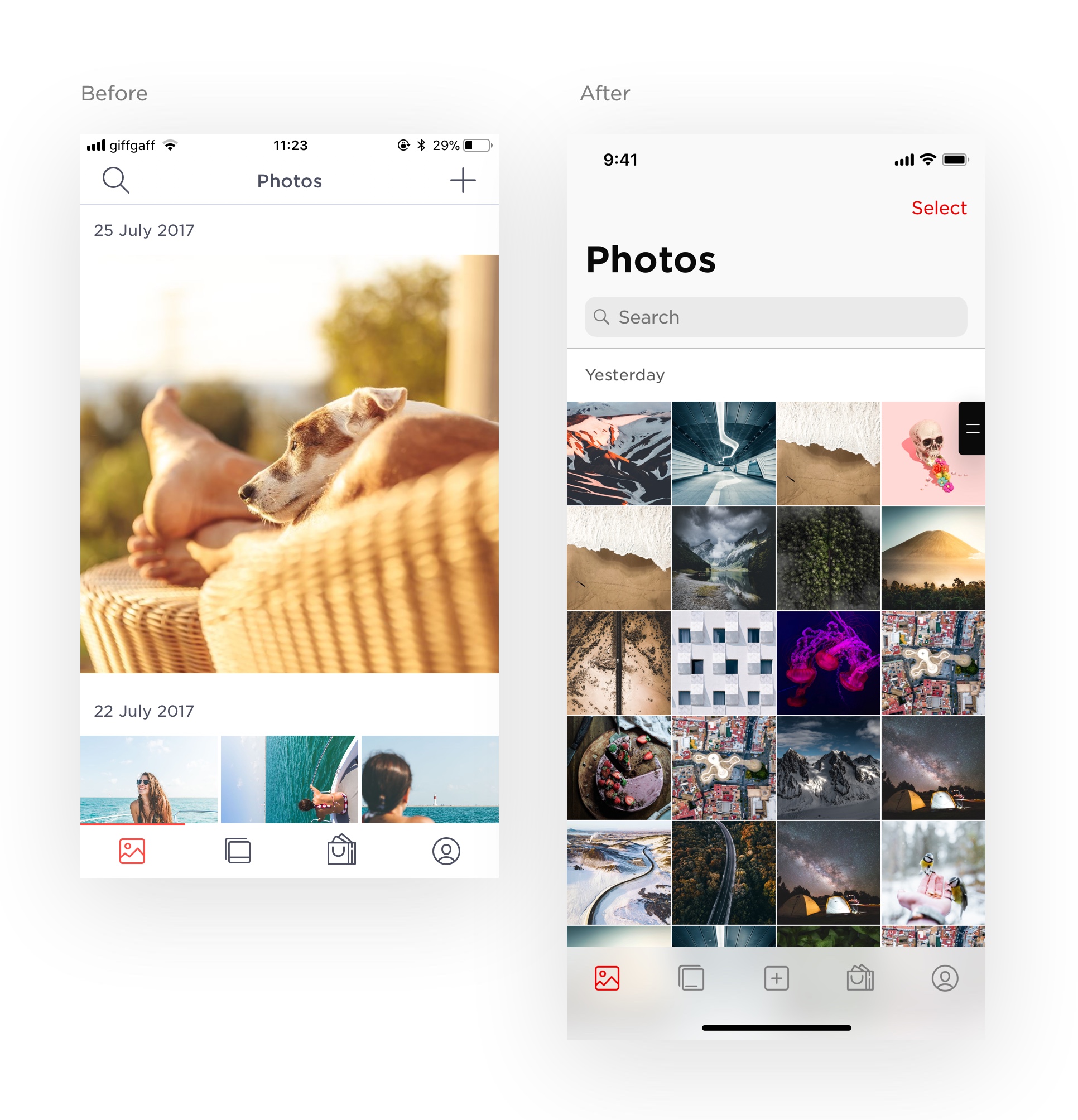
The layout of the image thumbnails was simplified. The previous design used a three column grid with occasional images picked out at random to fill the screen. The more complex layout impacted performance, and testing showed that making thumbnails smaller by adding a column made it easier to browse and locate photos. Scrolling to a given date was made easier by switching to sticky date headers. On the albums page we introduced a much requested feature allowing users to choose what order albums are listed.
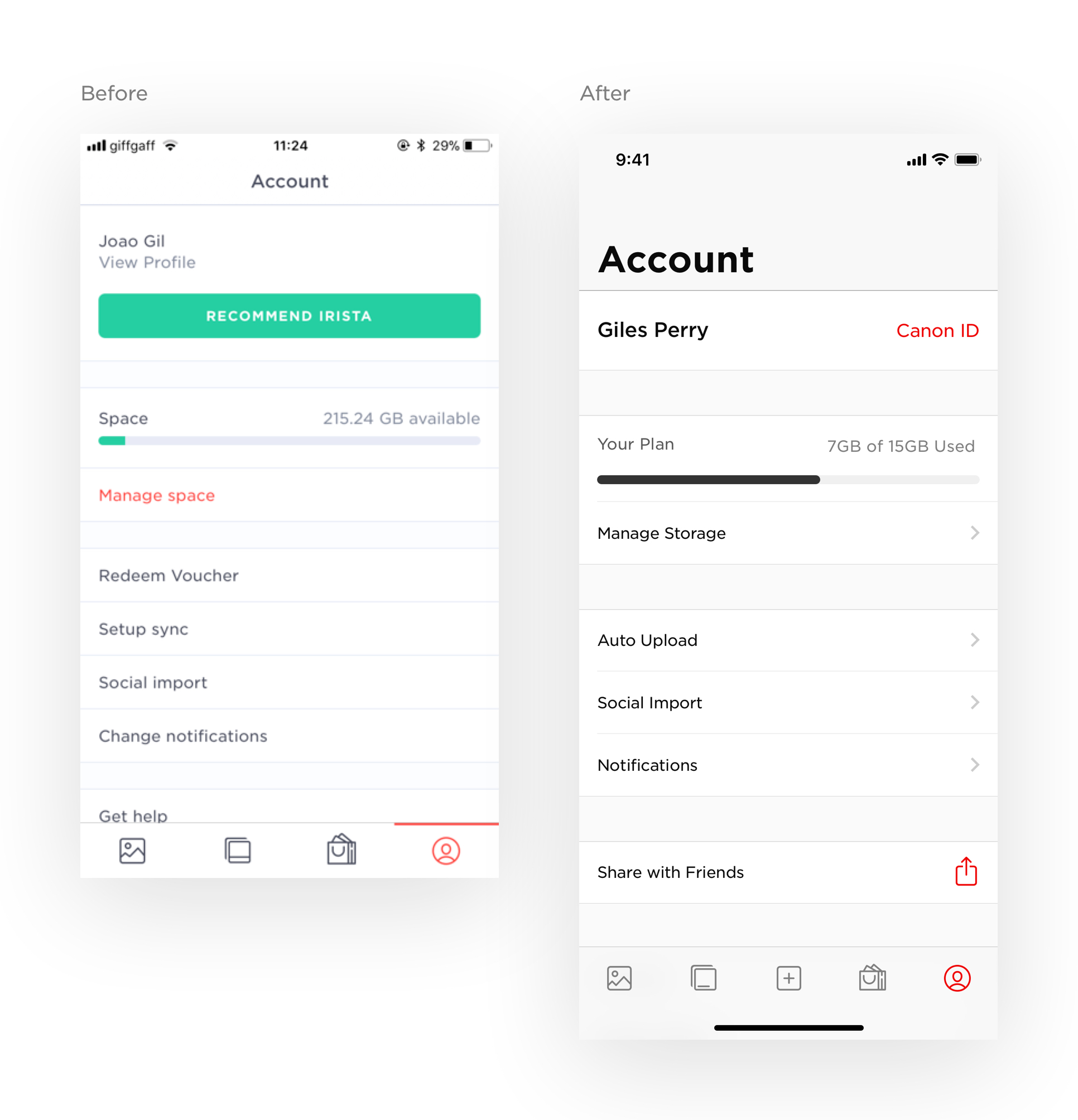
On the Account screen, items were reorganised into less arbitrary groups, we clarified the language used for labels. We added indentation to lines separating cells in a group, and chevrons to indicate when a cell connects to a sub-page.
Android Navigation
On Android, navigation has been significantly improved by introducing a bottom navigation bar in place of a side navigation drawer, while collapsible ‘Prominent’ top app bars on primary screens give these screen more presence.
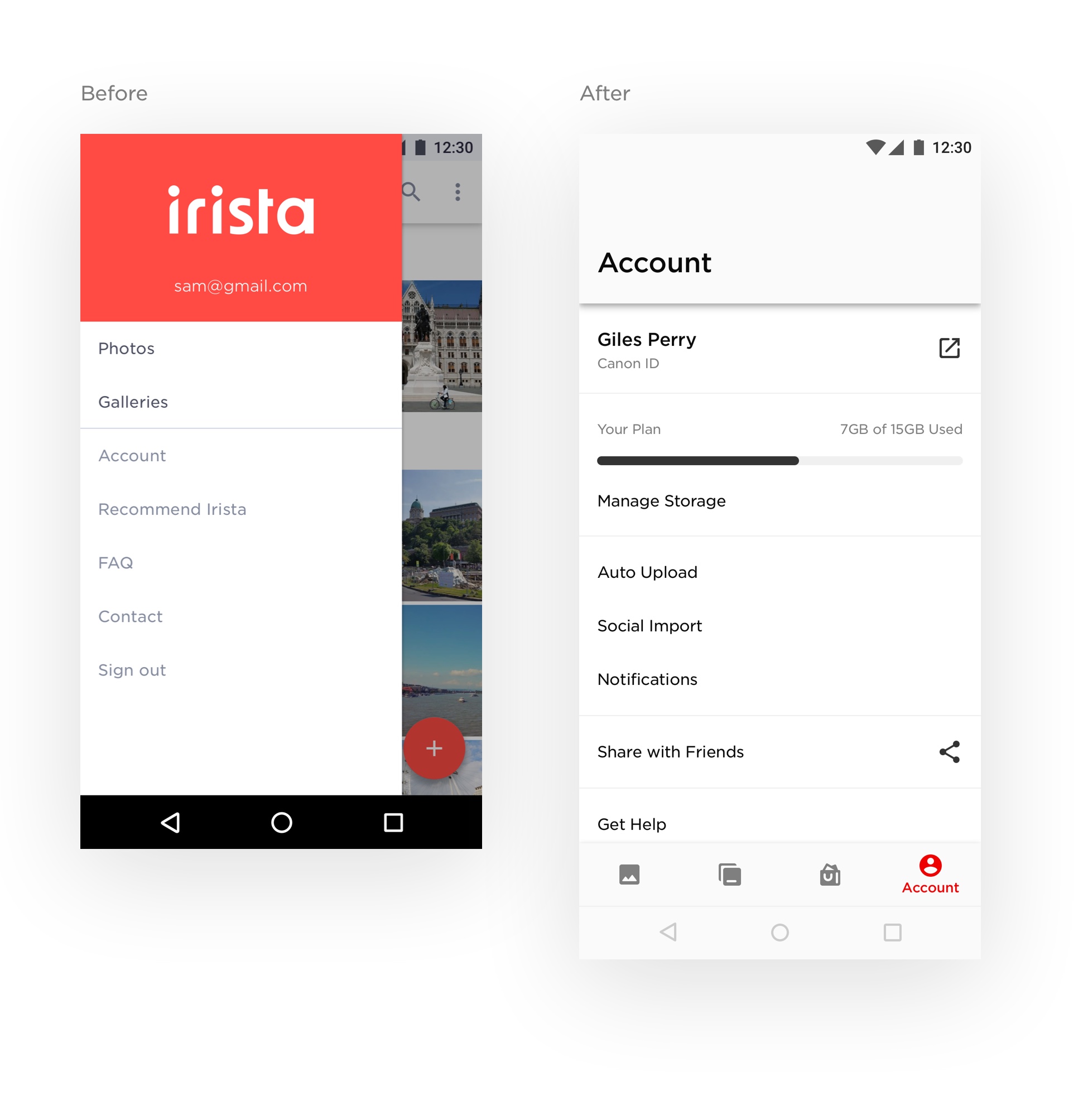
Material Theming has allowed us to improve visual consistency across Web, iOS and Android while remaining true to Material guidelines.

Team
Aurelien Guichard – Product Owner
Laszlo Csernetics – Delivery Manager
Giles Perry – Head of Design
Joao Gil – UX & Product Designer
Robin Dorpe – Lead iOS Developer
Igor Nakonetsnoi – iOS Developer
Lampros Gkotsoulias – Lead Android Developer
Lang Adam – Android Developer
Alex Bársony – Front-end Web Developer
Boros Gabor – Front-end Web Developer
Daniel Zahoran – Front-end Web Developer
Results...
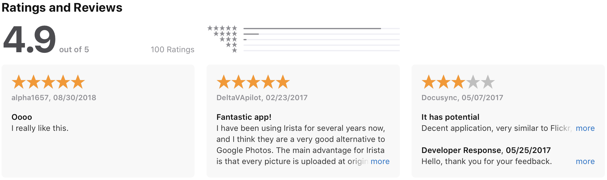
Significantly improved App Store ratings: